The Great Gatsby
An illustrated special edition project that I created for my school capstone project. The project was done solely by me and was an exercise in creating a print-ready book by the end of the term. I designed the cover, the formatting and layout, and the illustrations, and I wrote the forward at the book's beginning. The project ended up being 120 pages of the American literary classic The Great Gatsby and was created in three months inside and outside of the class. The project underwent many revisions and phases of critique.
The Objective and Process
The Capstone course was very open-ended for us. My class was tasked with a project of their choosing to focus on for the duration of the semester. I was very excited to create an illustrated version of a classic (and public domain) book. The Great Gatsby entered the public domain in 2021 and it was a story I was familiar with. This made it significantly easier to think about the project materials and timeline. There were three main aspects to the project: The cover, the text, and the illustrations.
I began with the text
I began with the text
The Cover
The first cover (right)
Initially, I wanted to create a black book cover with the martini glass being the central focus. The only colour on the cover would have been a vibrant green to represent the light that Gatsby sees across the water. As you can see I was still playing around with multiple fonts in an attempt to 'feel out' the tone I wanted to strike on the cover.
After the first round of critiques, I found that the reception to my ideas was less than positive so I scrapped the black and green for something more eye-catching. I streamlined the text on the cover to be from the same family.
You can see in this version that I kept a few of the basic ideas, but through rounds of ideation, the cover grew much stronger.
The second cover (right)
This second iteration introduced the green and yellow cover design that would remain in the final copy. Through the use of mood boards and sketches, I created the image of the woman in the martini glass. The smoke coming from her cigarette was not joined with the 'S' in the title which led to an awkward twist in its curve. Again, this would be fixed in the final iteration. I retained the border but with an added element that felt a little bit more art deco.
I used the same typeset for all of the text on the cover to fit the minimal look that I was going for. The spine contains some elements meant to enhance the decorative quality of art deco but was removed after the second round of critiques found that they "resembled airplanes".
I used the same typeset for all of the text on the cover to fit the minimal look that I was going for. The spine contains some elements meant to enhance the decorative quality of art deco but was removed after the second round of critiques found that they "resembled airplanes".
The final cover (below)
After a third round of critiques, I solidified my ideas. The author's name was brought up to be above the central title. The spine contains both names in place of the old designs and the quote on the back was replaced with one that would better fill the space. The "illustrated by" section was shrunk and moved to the left to leave room for the barcode.
The Illustrations
The main bulk of this project was creating the illustrations. From the outset, I wanted to create my own illustrated edition of a classic book and this capstone project was an opportunity to do so. There are one small and five full-page digital drawings.
The Chapter Header Images
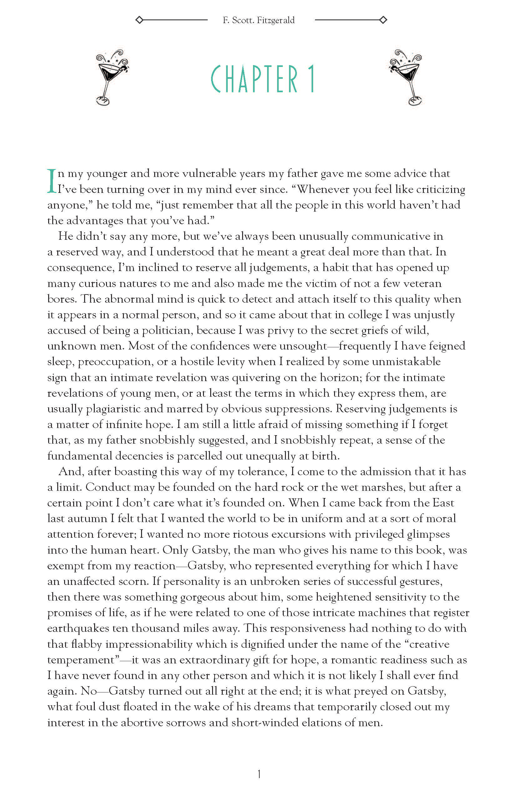
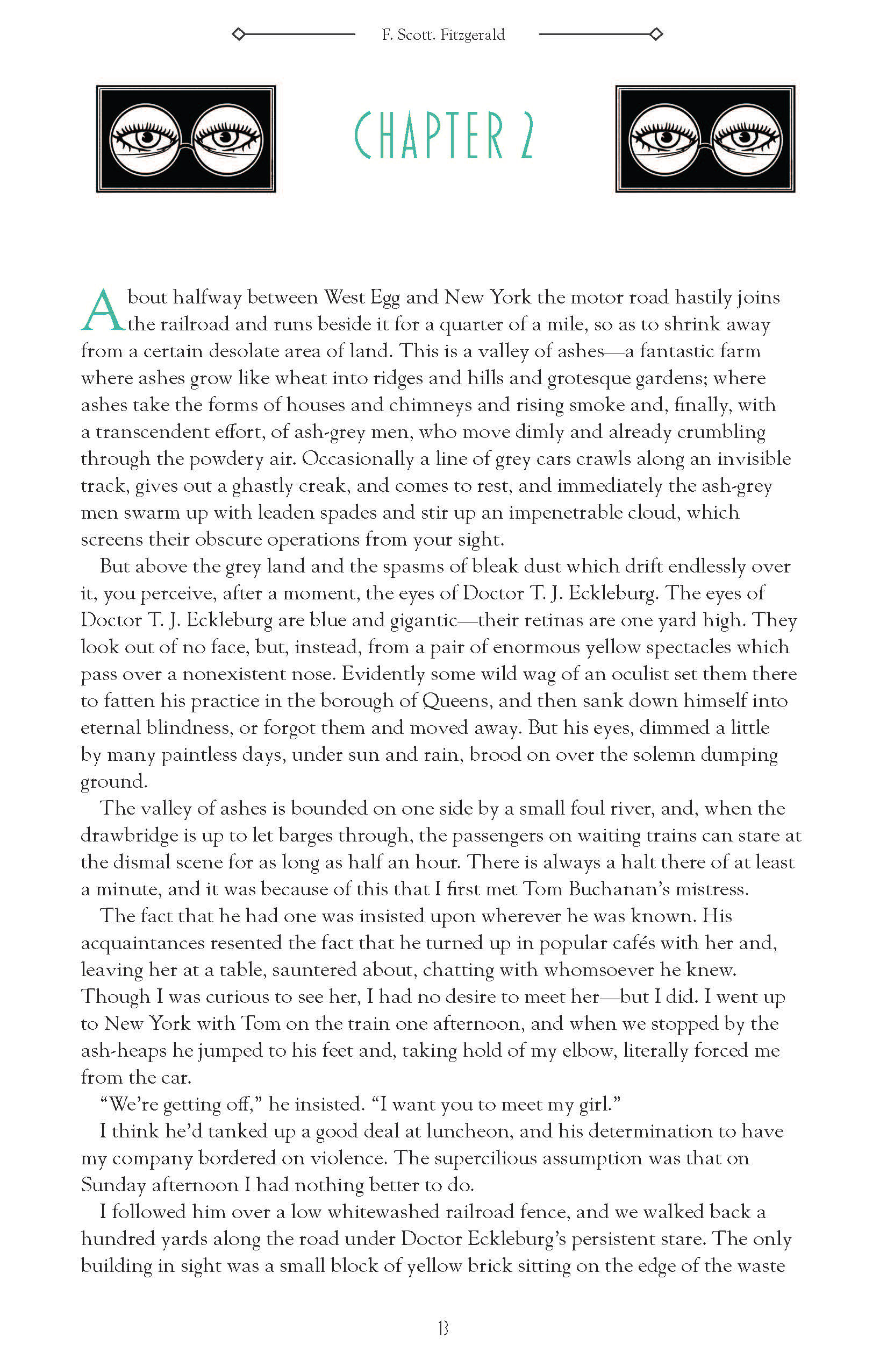
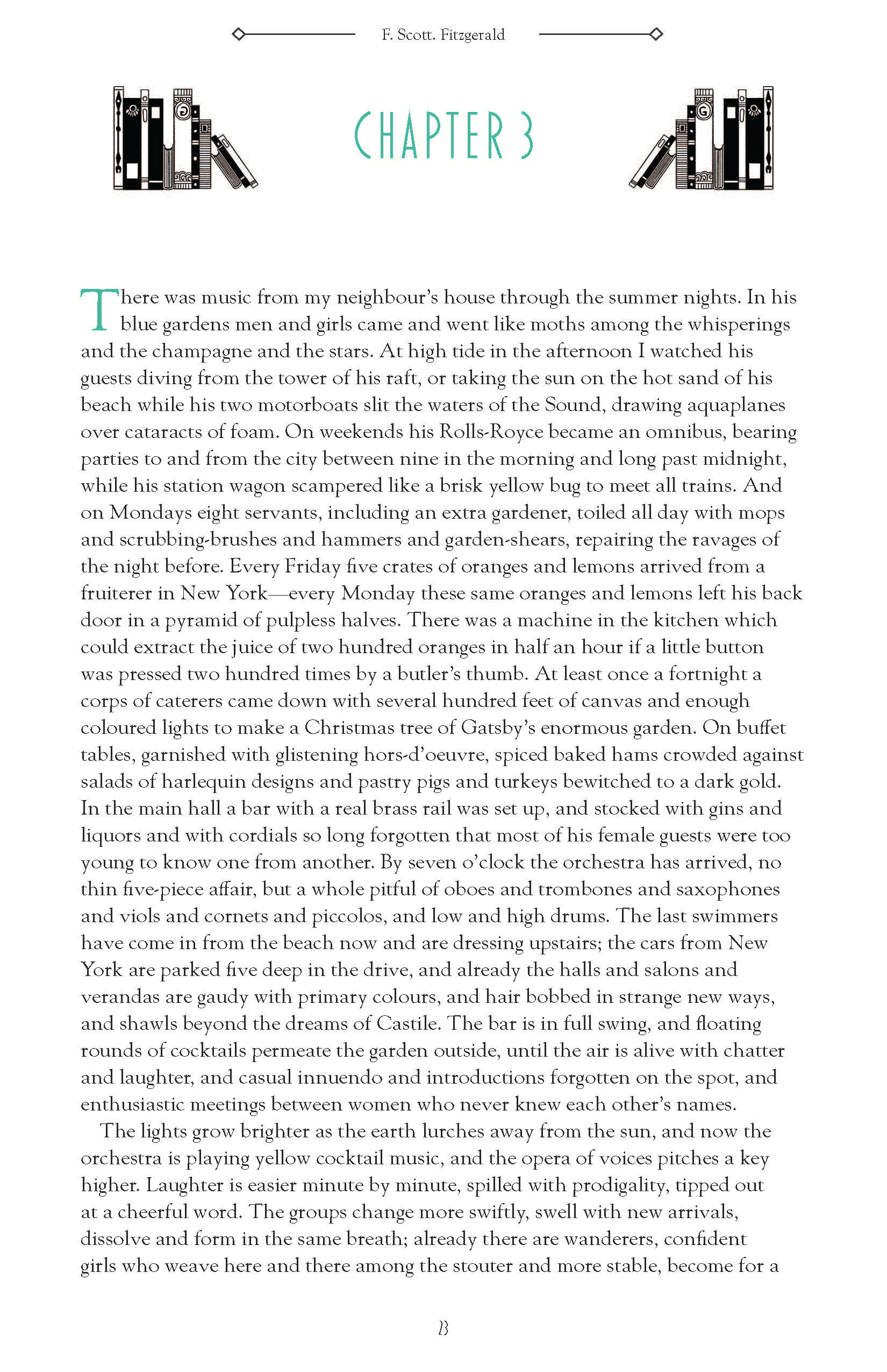
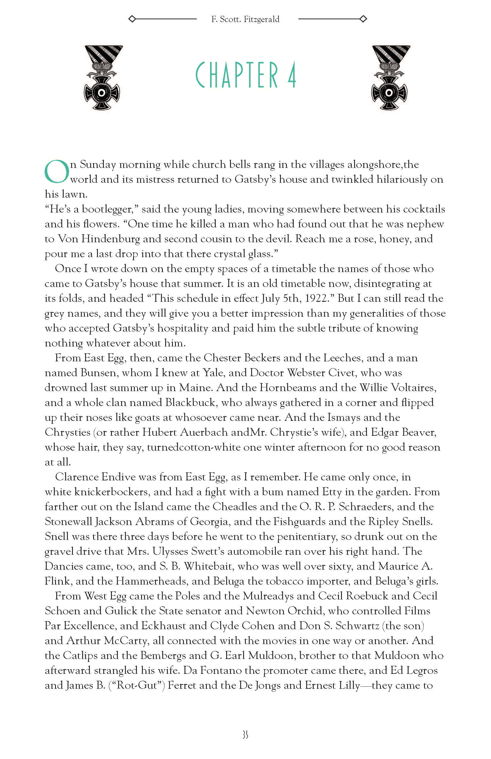
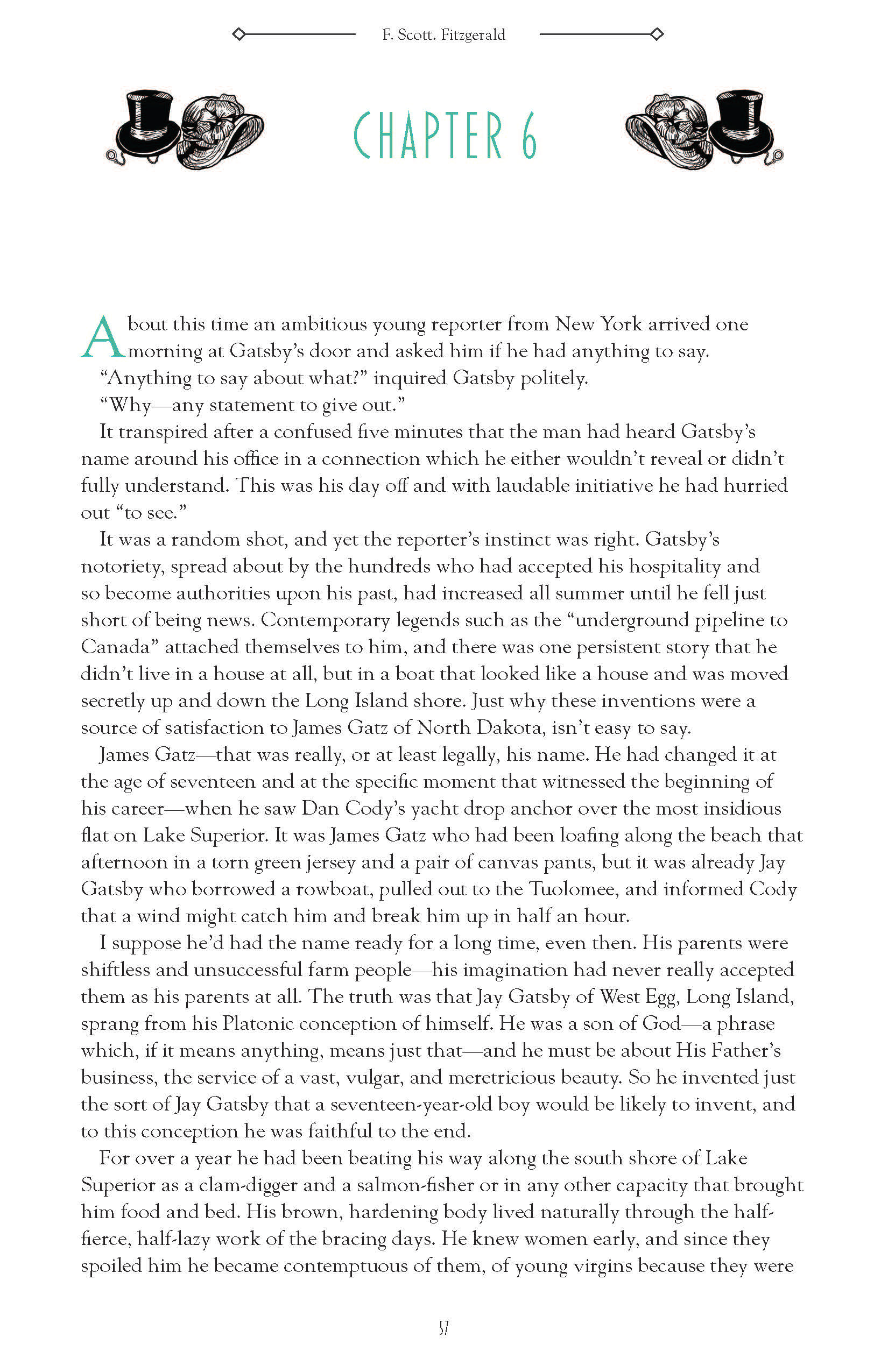
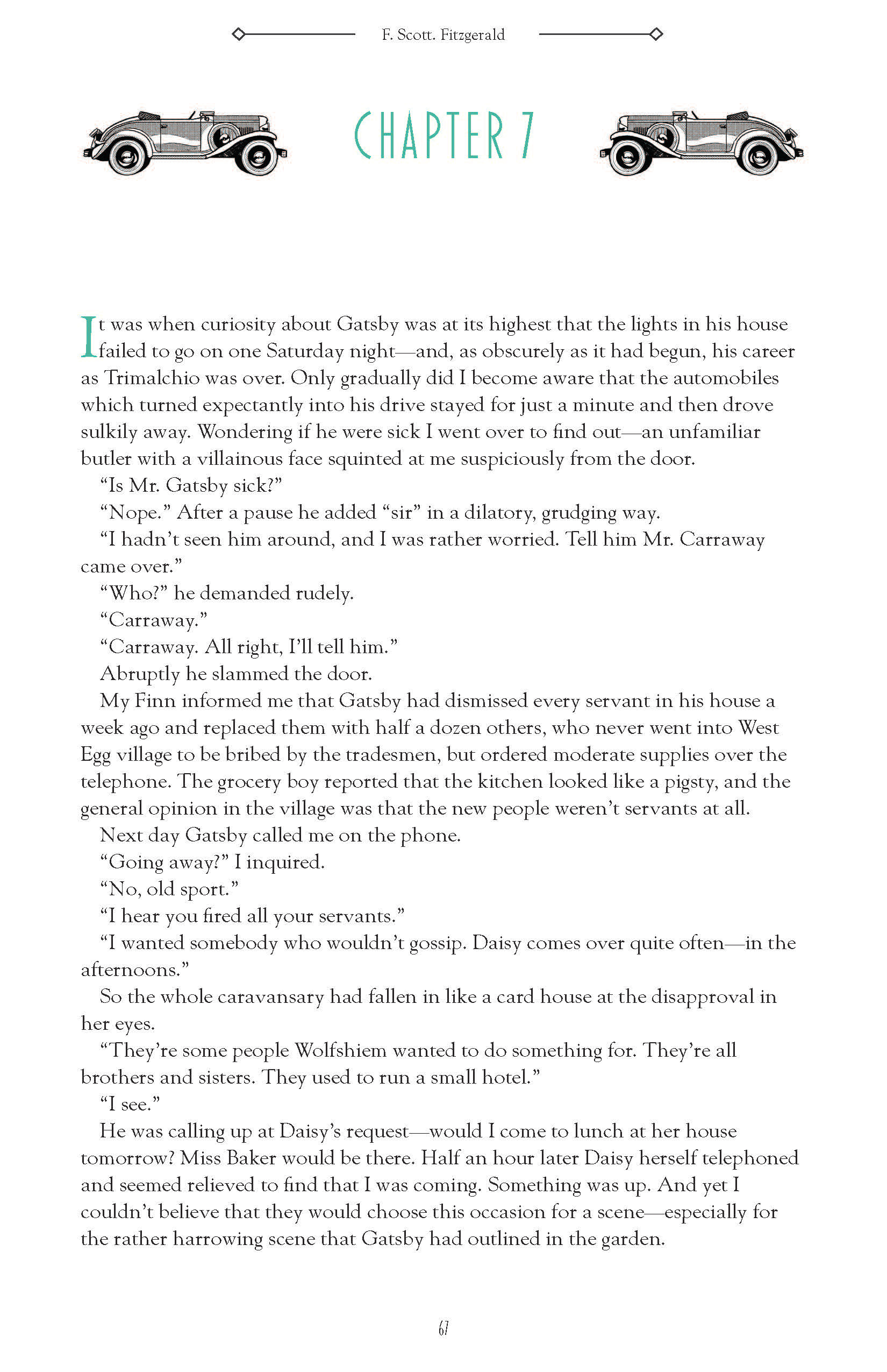
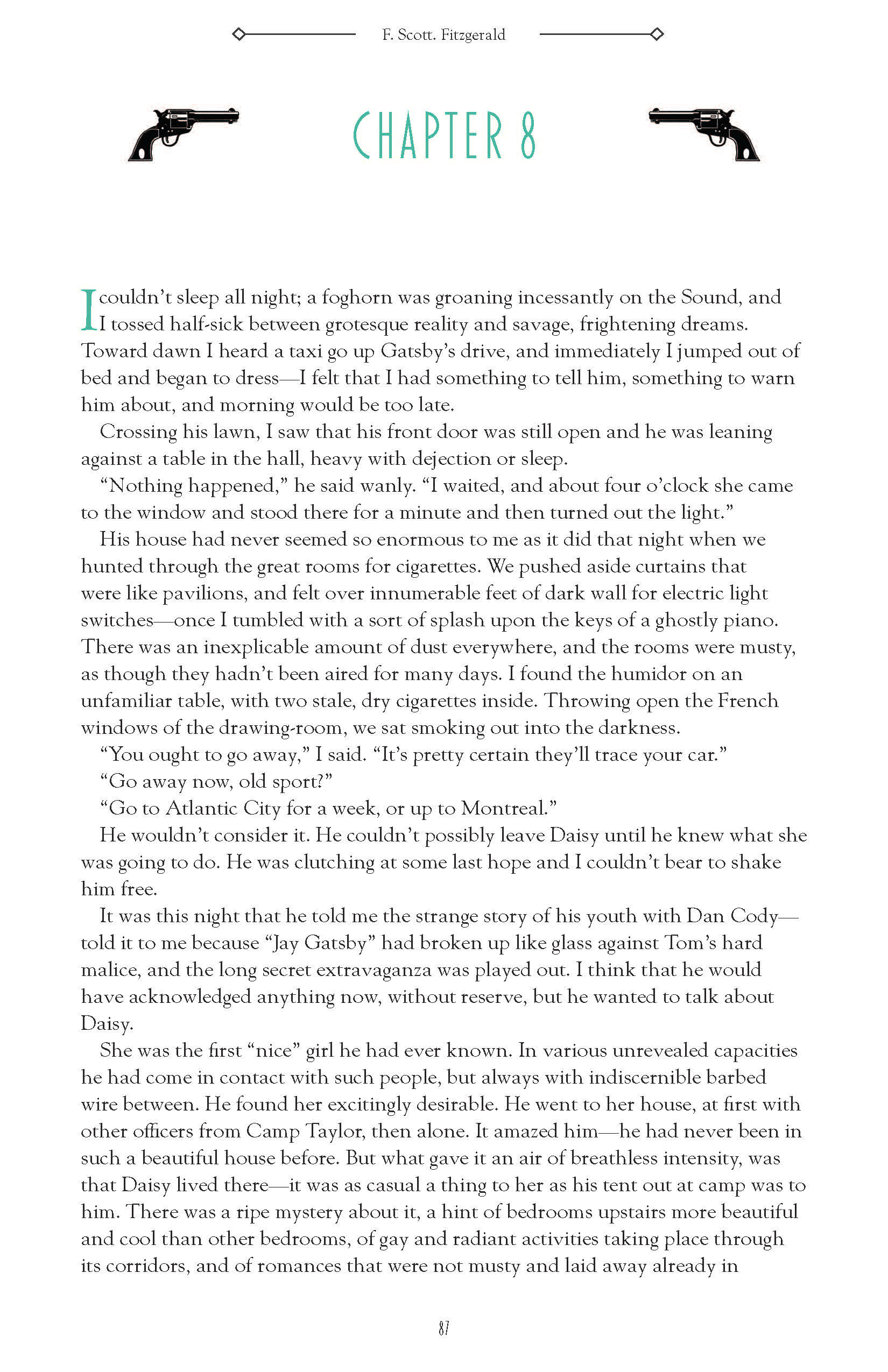
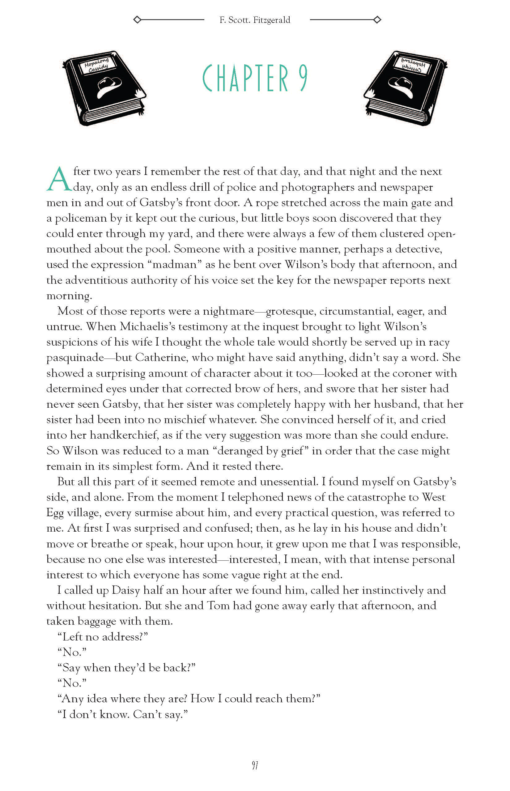
Each chapter header was unique. This was so that they would represent an important object or theme within that chapter. The images are in order from left to right for their chapter. These were finished roughly within the same time frame so they did not undergo the same iterative process that the rest of the project had gone through.
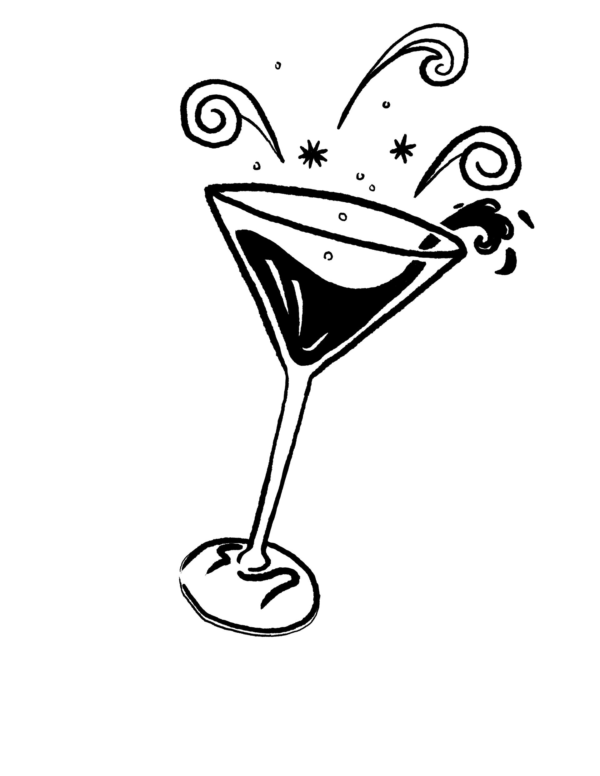






The Chapters
The first layout (right)
Initially, the design was very basic with only a header and body text. This was more for practicality than design sense due to a large amount of text being imported into the document. For this initial phase, I was attempting to keep organization at the front of my mind.
The final version of the chapter headers introduced a green colouration in the header text as well as the drop-cap. This was a suggestion given during a critique period and I liked how the end result appeared. Below are all of the chapters with their representative images.
