This project was for the client Trimac, a shipping and logistics company with a presence all over North America. Our design team was tasked with taking the old brand look and revitalizing it through a months-long process.
The entire project consisted of three elements. The brochure redesign, web banners, and finally the brand redesign document detailing the entirety of the company image. My role in this project was to create brochures for the client.
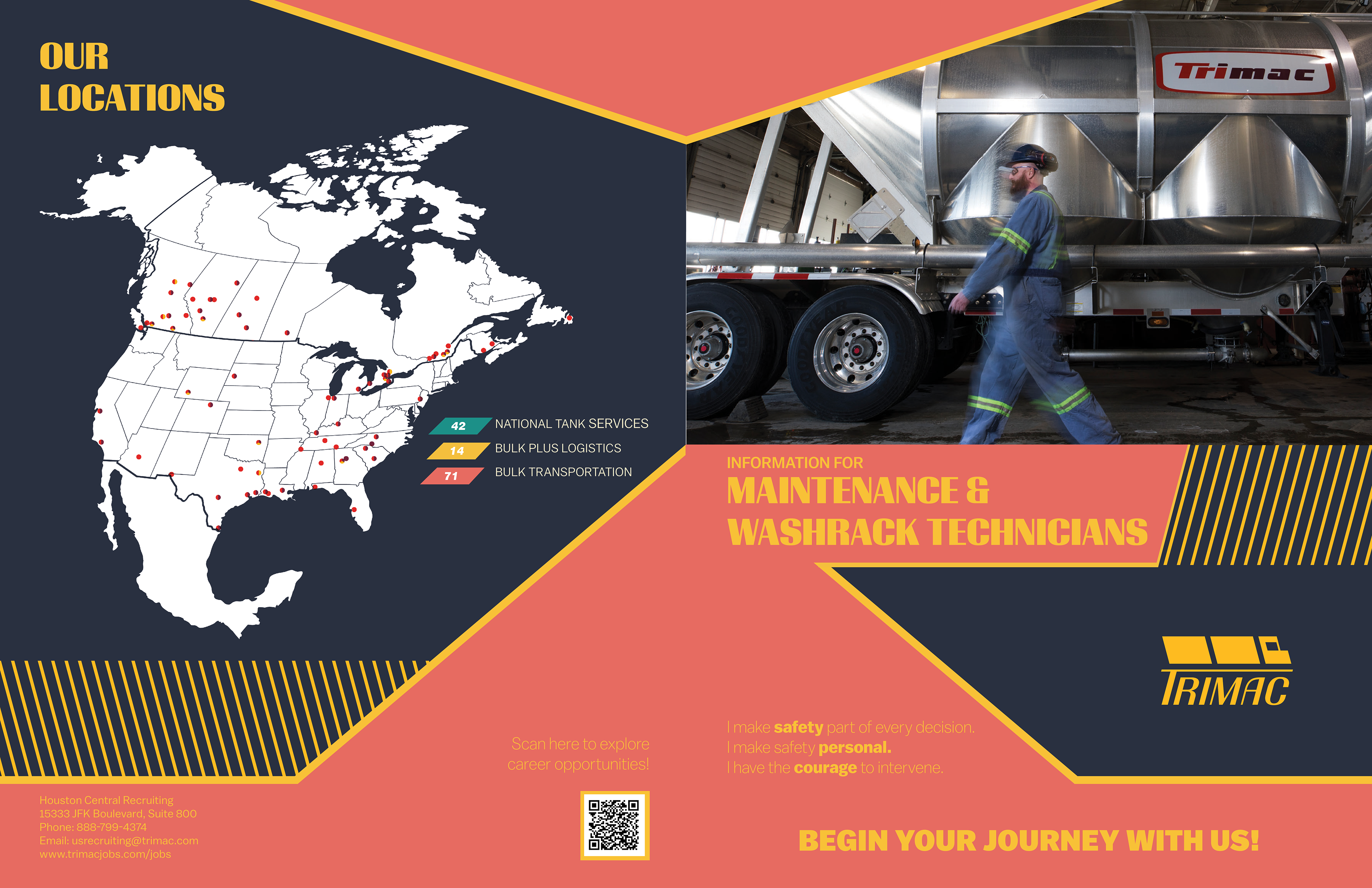
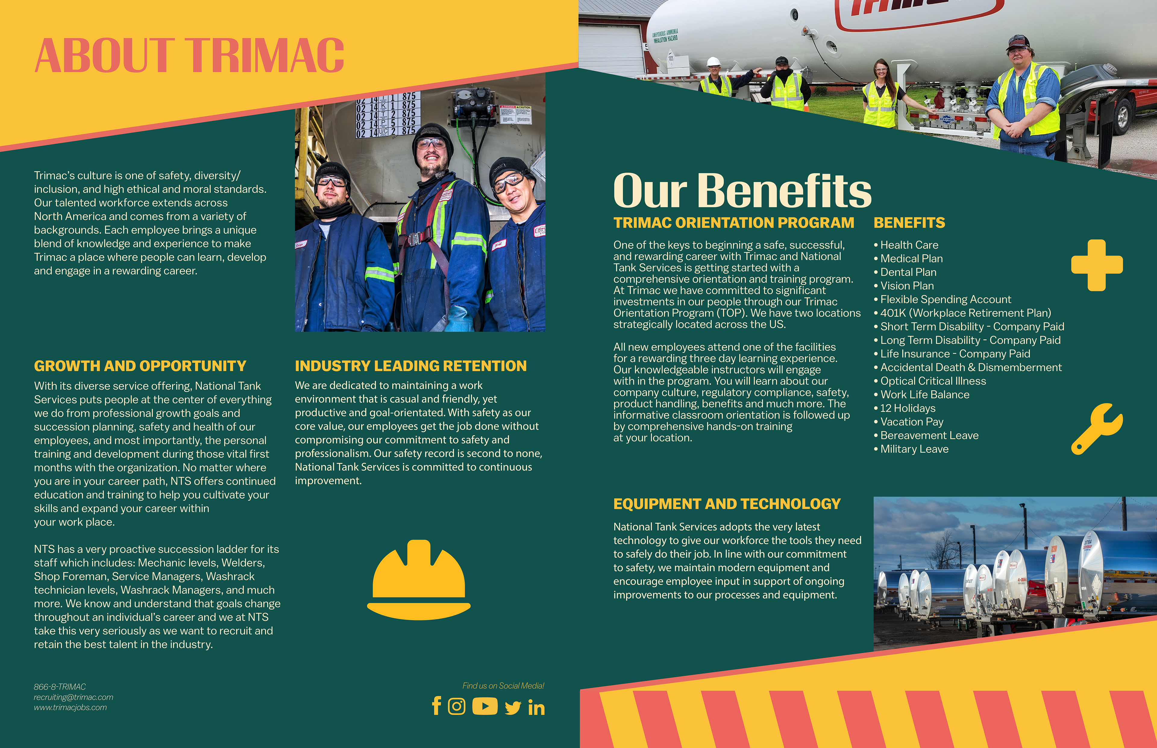
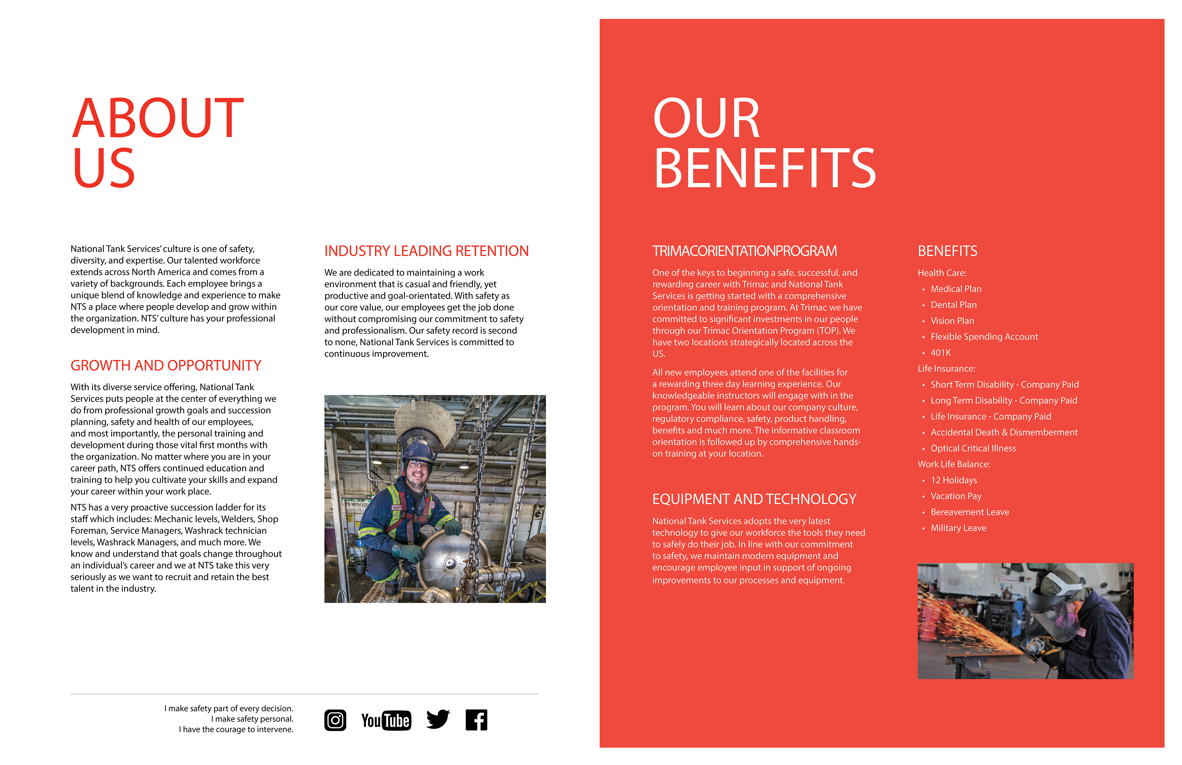
The outside (left), and inside (right) of the brochure for maintenance and washrack technicians.
These first two are an example of the old design before the team tackled its new image. I selected which elements to exclude from the original and which to add later in the process.
The initial issue with the original versions was their empty nature and unimaginative layout. Some information within the listing of the benefits is repeated, and each brochure contains the exact same elements. This results in them being visually interchangeable.
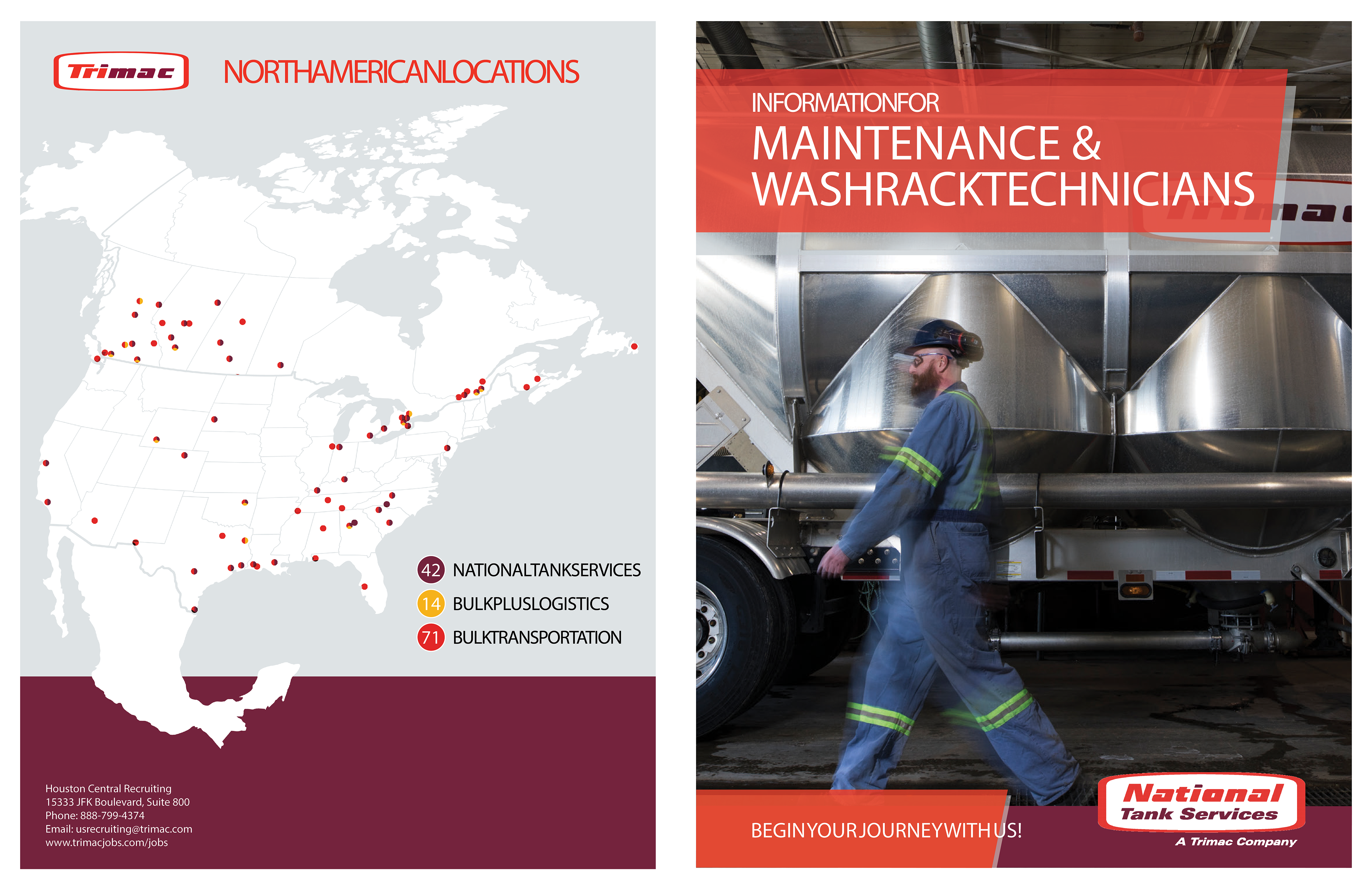
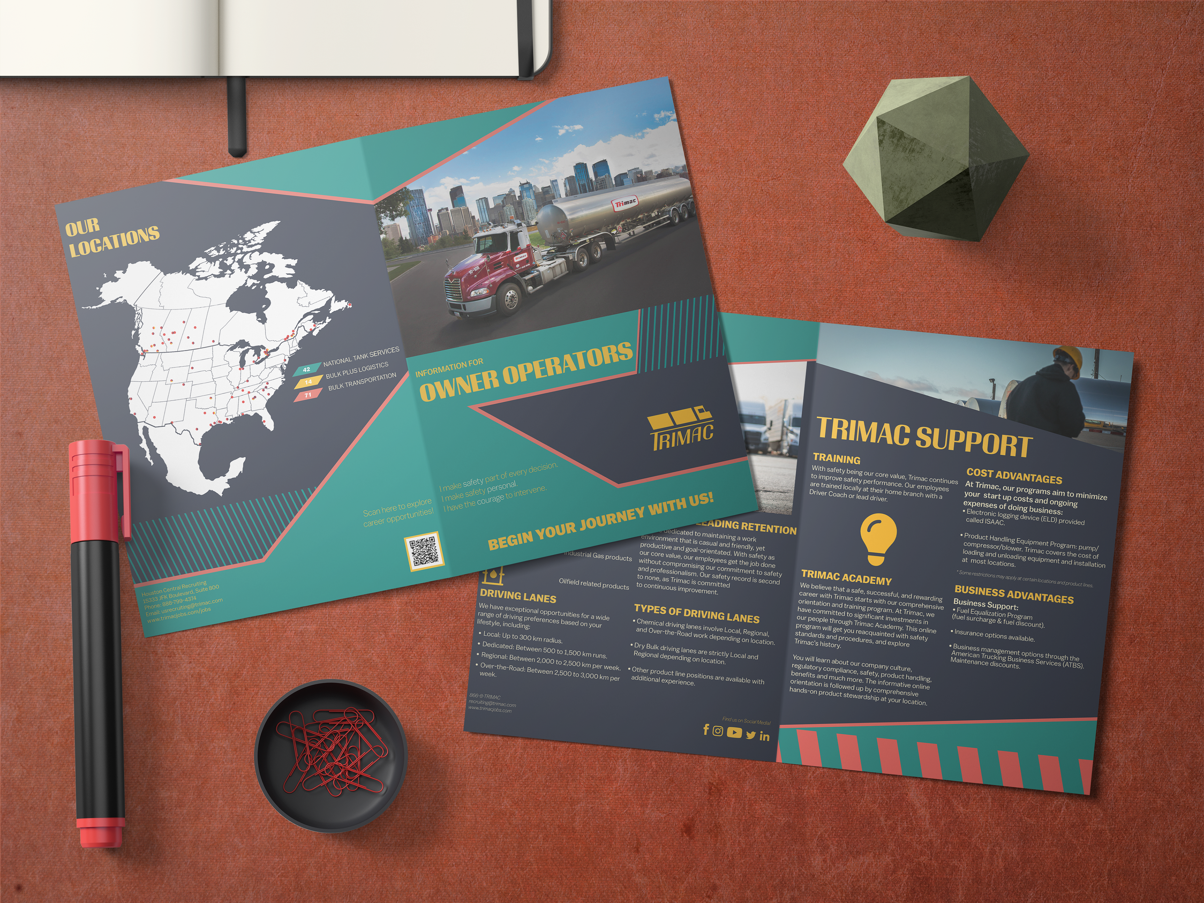
The first iteration of the redesign (outside). We wanted to go with an angular design that spoke to the feeling of speed that the client wanted to adhere to. We also wanted to make the colours much more noticeable. These versions were decent but upon review, it was requested that we push our ideas further in future iterations.
(Inside of brochure)
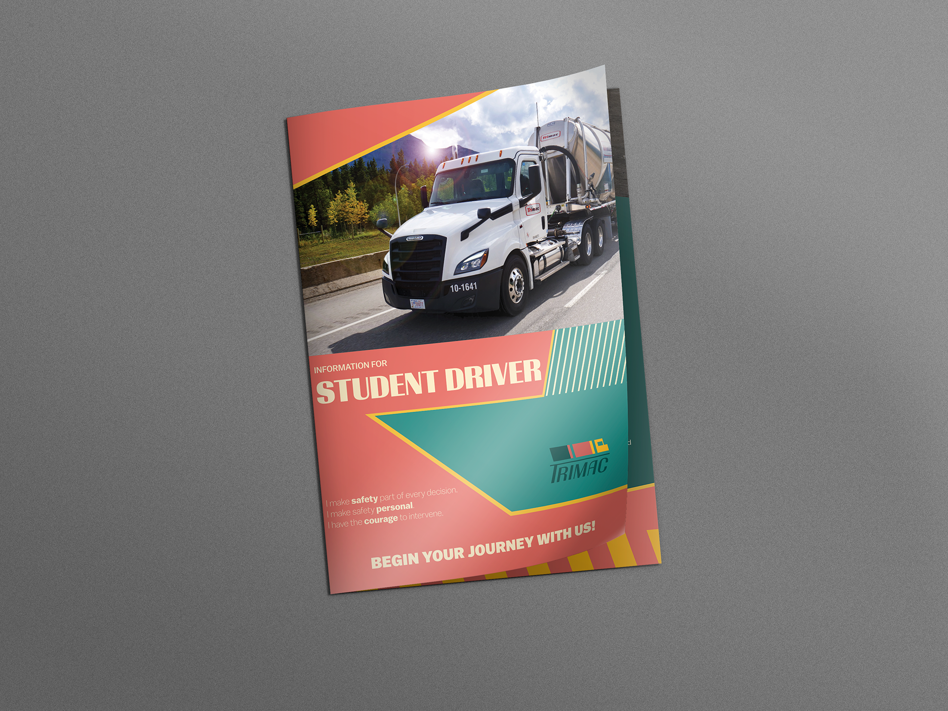
Finally, after the last iteration, I created alternate colour variations of each of the brochure designs. These ones pushed the new brand colours to really keep the reader's attention. The goal for these was to create a document that would promote the reader to keep it around rather than treat it as disposable. Icons are implemented to keep visual balance while also fitting the written content of the document.
